The Challenge
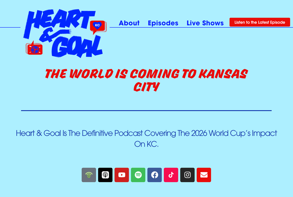
Heart & Goal needed a digital home for a podcast exploring the 2026 World Cup and its impact on Kansas City. The website had to introduce the show, establish the hosts’ credibility, connect visitors with episodes, and communicate the opportunity to potential sponsors. The starting materials were limited: visual assets from a spec sheet and a one-page sales sheet that provided the foundation for the messaging. There were no finished website designs or complete pages of web copy to implement. My job was to turn those ingredients into a complete website—defining the structure, designing the experience, developing the content, and building the finished site.
What I Owned
The Approach
Turn a small set of brand materials into a complete digital home for the show.
A complete WordPress website that gives Heart & Goal a cohesive digital home—bringing together the show’s story, hosts, episodes, live events, and sponsorship opportunities. The project began with supplied visual assets and a single page of sales copy. I turned that starting point into the website’s structure, design, expanded content, and finished build. It demonstrates my ability to take a project from limited source materials to a complete web experience, owning both the creative decisions and the development needed to bring it to life.
Inside the Build
From Sales Sheet to Website Copy
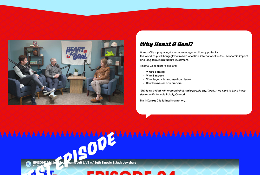
A sales sheet presents a concentrated pitch. A website needs to introduce ideas progressively and help people find information in different ways.
I expanded and reorganized the supplied messaging into page-specific copy, creating a clearer distinction between explaining the podcast, introducing its personalities, and presenting the sponsorship opportunity.
A Visual Identity Built for the Web
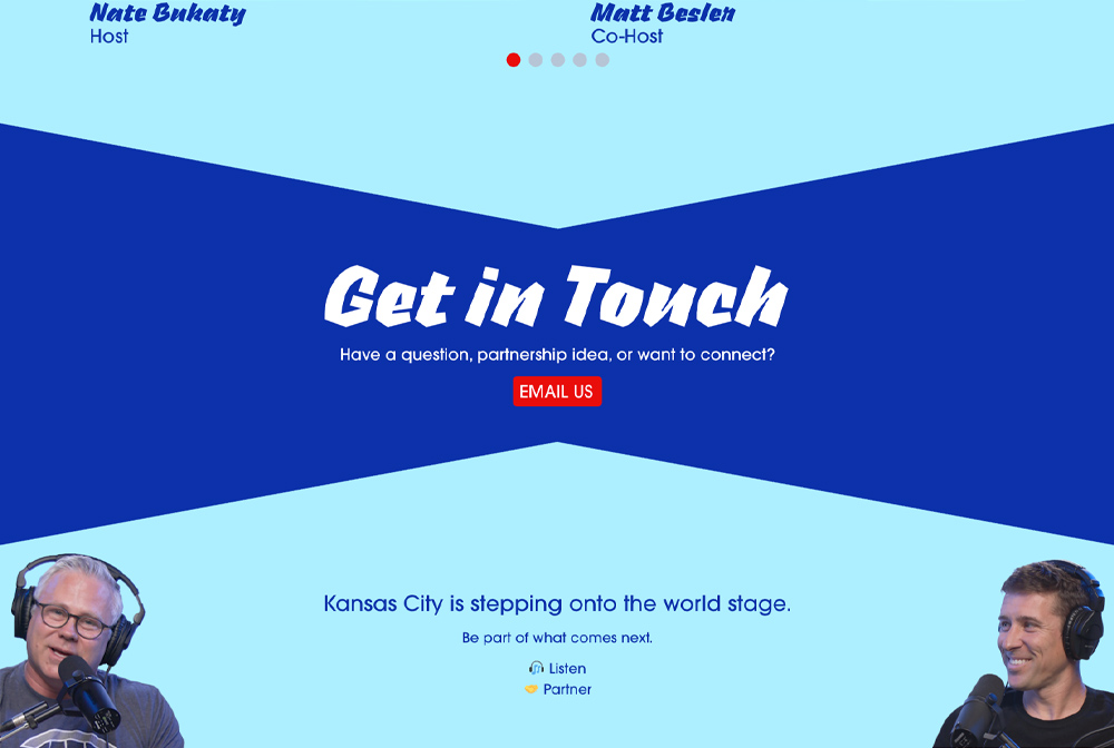
I used the supplied assets as the foundation for an original website design. Rather than working from finished page mockups, I determined how the brand should appear across the interface—from prominent introductory sections to supporting content and calls to action.
The result carries a consistent visual identity through pages with different purposes.
Listener and Sponsor Journeys
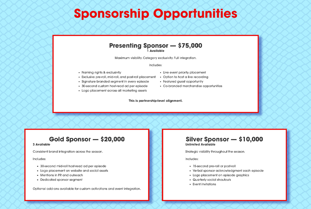
The site serves two important audiences: people interested in the podcast and organizations interested in supporting it.
I gave listeners clear routes to the show and its episodes while creating a dedicated sponsorship page that presents the partnership options and a direct way to start a conversation.
A Home for Every Episode
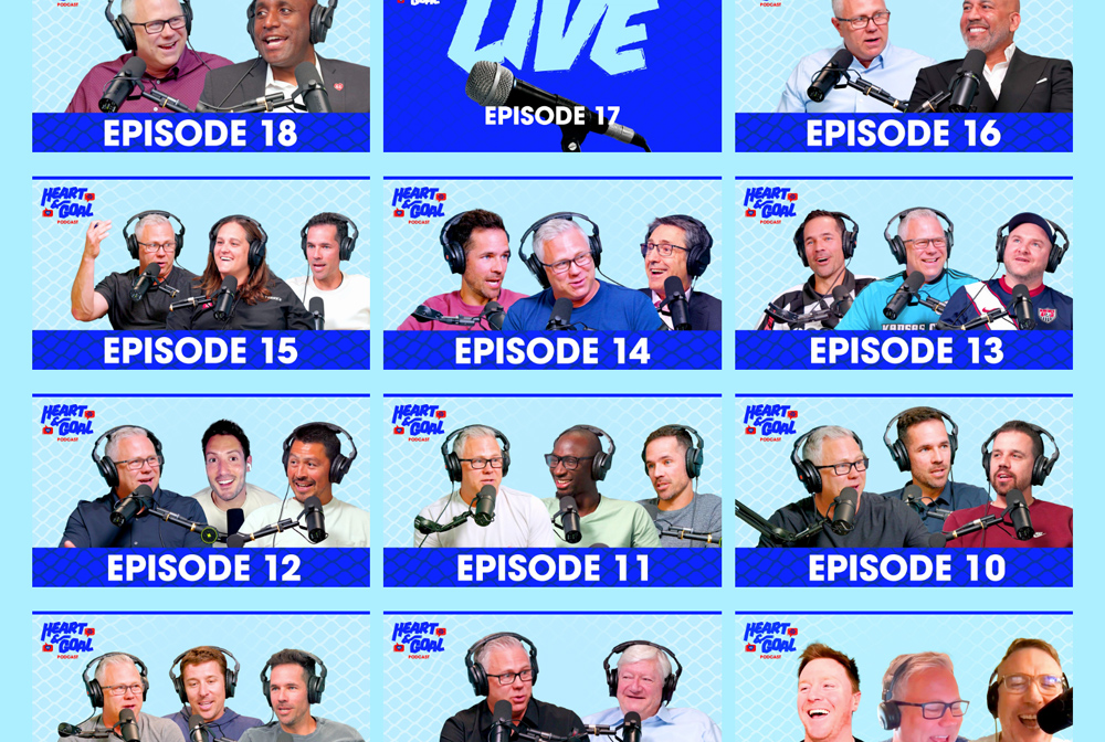
I designed and built the episode browsing experience, giving visitors a dedicated place to explore the show beyond the homepage’s latest episode.
The episode archive and individual episode pages bring the content into a consistent format, making it easy to discover past conversations and choose what to watch or listen to next.
Responsive Design and Development
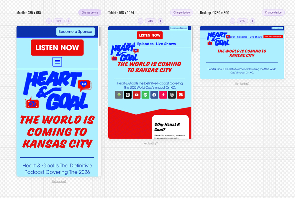
I designed how the content, imagery, navigation, and calls to action adapt across desktop, tablet, and mobile.
That work extended beyond resizing the desktop layout. It required decisions about stacking, spacing, text hierarchy, and the order in which information appears on smaller screens.